
2026 Interior Design Trends: Color, Texture & Confident Spaces
Insights by Willem Hendrik Design
Index
Color Trends in 2026
Fabric & Upholstery
Furniture & Form
Art & Objects
Etsy Is Back — The Handmade Revival
Paint Finishes & Applications
Wallpaper & Surface Statements
Paint Vendors & 2026 Colors of the Year
Taste-Makers & Influencers to Follow
Color Trends in 2026
Dusty Jewel Tones & Color Layering
Muted emerald, cranberry, and deep sapphire create richness without heaviness. The key is balance: pairing saturated textiles with neutral envelopes so color becomes depth, not distraction.

© Courtesy West Elm

© Courtesy Arhaus

© Courtesy CB2

© Courtesy CB2
Warm Neutrals & Earth-Rooted Palettes Continues
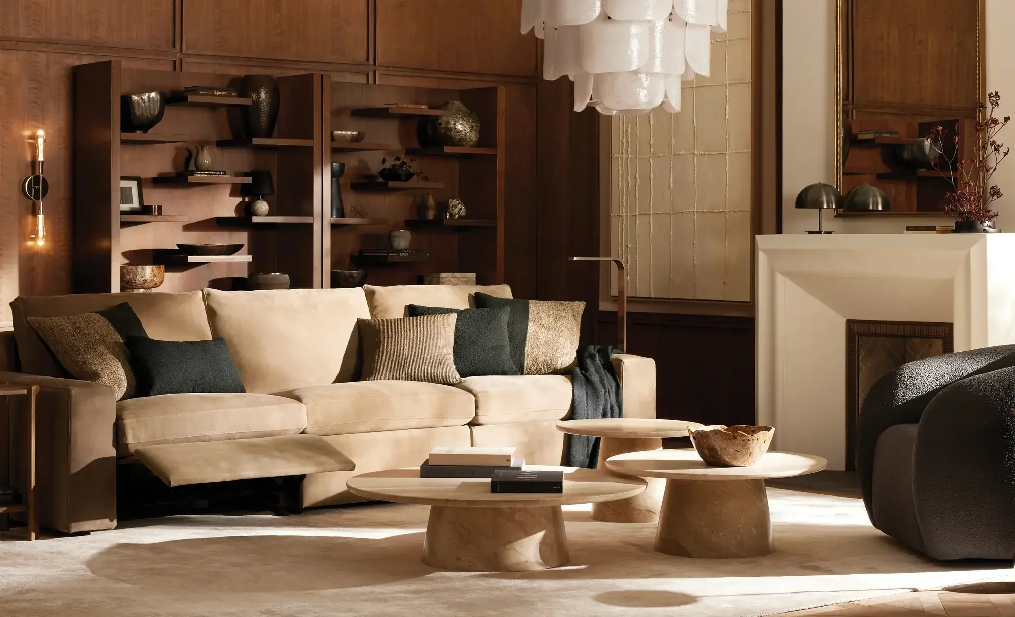
2026 replaces sterile whites with lived-in warmth. Tobacco brown, sun-baked terracotta, dusky olive, and soft greige dominate — grounding shades that feel both permanent and personal. These tones connect interiors to nature and pair beautifully with tactile materials like wool, linen, and stone. From Central Oregon’s mountain palette to Miami’s coastal glow, warmth is redefining calm.
© Courtesy Arhaus

© Courtesy Lulu & Georgia

© Courtesy Crate & Barrel
Unexpected Pairings & Color Capping
Designers layer multiple shades of the same hue — forest green with sage, rust with blush terracotta — for cohesion and sophistication. “Color capping” (painting walls and ceilings in tonal harmony) adds quiet drama and unity.

© Courtesy Benjamin Moore

© Courtesy Benjamin Moore

© Courtesy Hello Flora
Full-Color Immersion & Bold Blending
Color is no longer just an accent — it’s a full-room experience. Designers are embracing immersive, tone-on-tone layering where furniture, fabrics, and millwork live within the same hue family. One wall is no longer enough. We’re seeing full color drenching — walls, trim, and ceilings unified in a single palette — with high-sheen finishes amplifying light, height, and drama.

© Courtesy Maestri Studio

© Eric Piasecki

© Courtesy Maestri Studio
Fabric and Upholstery

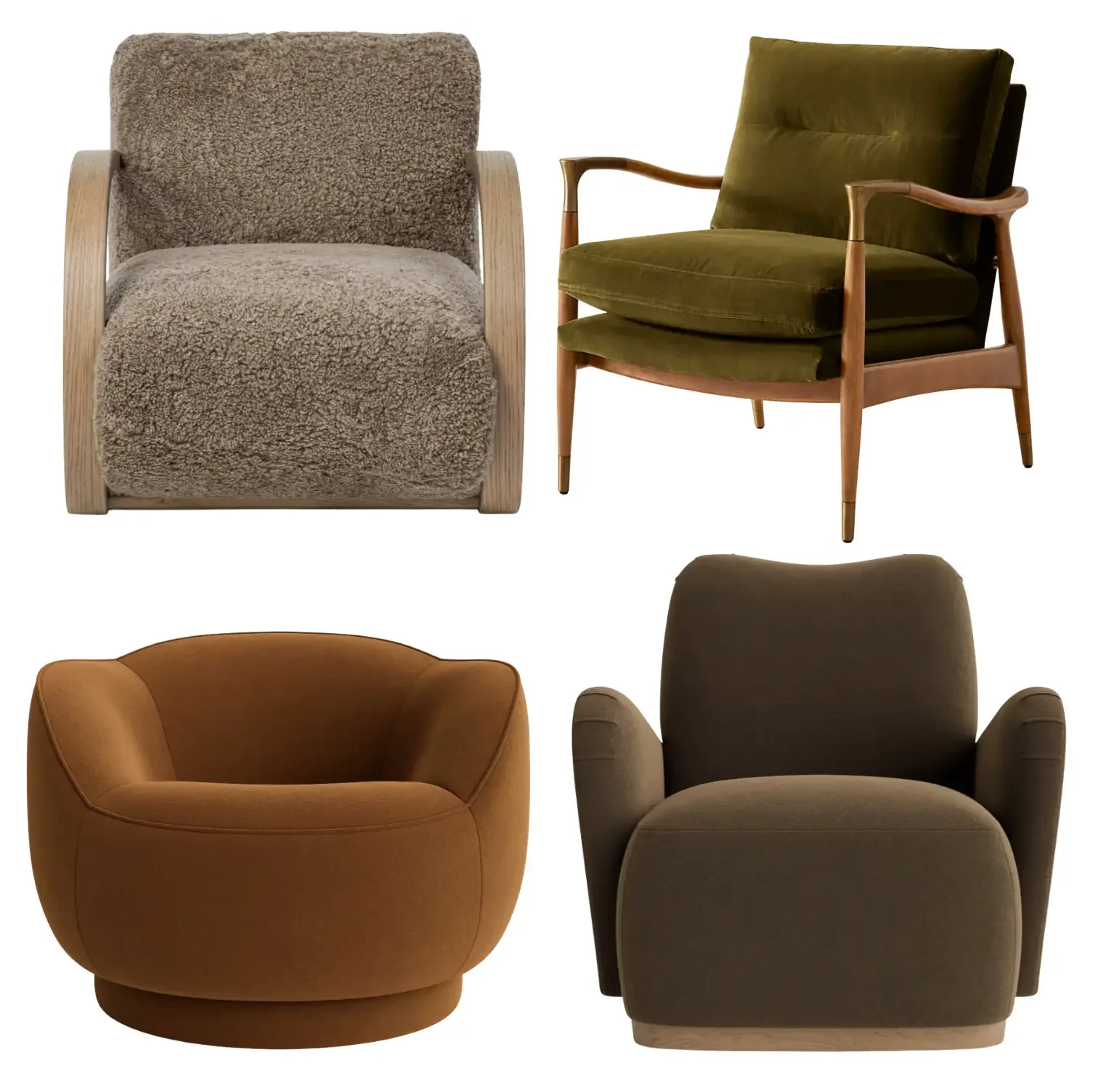
Clients are moving beyond bouclé and performance linen. Texture, not trend, defines 2026. Expect velvet, brushed mohair, sueded cotton, wool blend, and textured tweed. Material now holds visual power equal to form — an emerald velvet sofa or cranberry tweed ottoman can anchor an entire room. Rounded silhouettes and oversized seating dominate, inviting physical ease and visual softness. At Willem Hendrik Design, we’ve seen clients choose tactile, timeless fabrics that age gracefully and photograph beautifully.
Furniture and Form
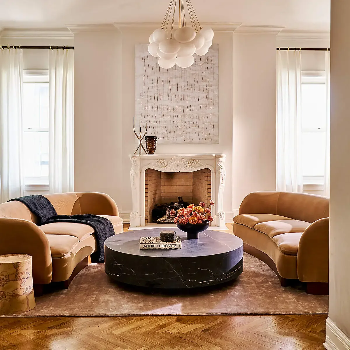
Furniture celebrates curve and weight. The once-rigid silhouettes of mid-century minimalism soften into sculpted, grounded pieces. Low, wide seating in mohair or nubuck, barrel-back armchairs, and irregular artisan tables define the season. The look is confident but approachable — quiet luxury without pretense. Central Oregon leans toward raw walnut and matte stone; Kansas City and Atlanta toward brass and color contrast; New York and Miami favor tone-on-tone polish and reflection.

© Courtesy Arhaus
© Courtesy CB2

© Courtesy RH
Wallpaper and Surface Statements
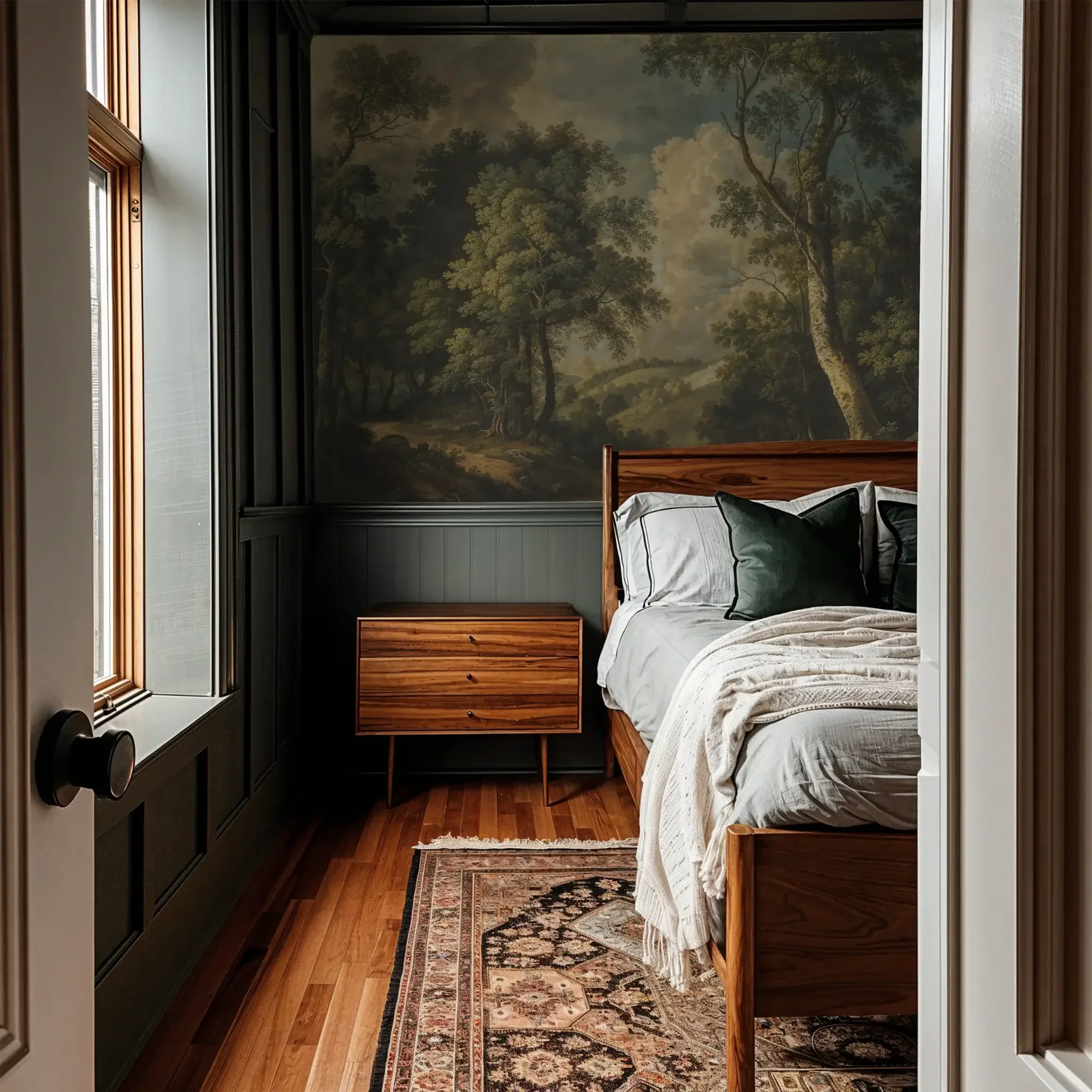
Wallpaper remains powerful — and it’s going bigger. In 2026, designers are wrapping entire rooms, ceilings included, in expressive pattern or natural texture. Landscape murals, linen grasscloths, and hand-painted designs are transforming flat walls into immersive art. From kitchen to washroom, ceiling to stairwell, wallpaper is redefining atmosphere. It’s not background anymore — it’s architecture.
For anyone told “you can’t wallpaper textured walls,” it’s time to unlearn that myth. Heavier, tactile wallpapers like grasscloth or woven vinyl easily mask mild texture — no expensive wall-skimming required. Both peel-and-stick and traditional adhesives work beautifully when applied correctly.

© Courtesy Blesserhouse
© Courtesy Wedded Woodland’s Wallblush

© Courtesy Willem Hendrik Design
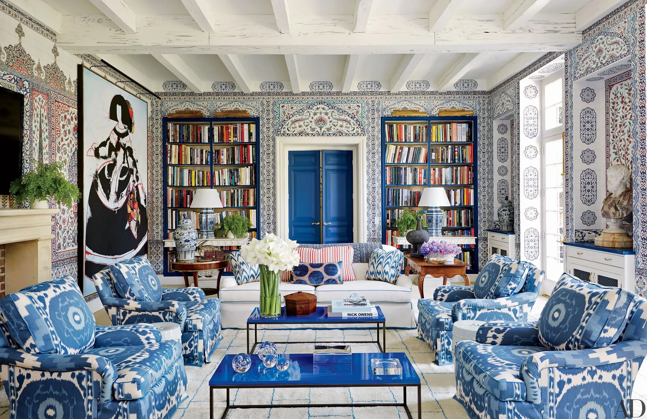
© Courtesy Thomas Loof - Designed by Miles Redd
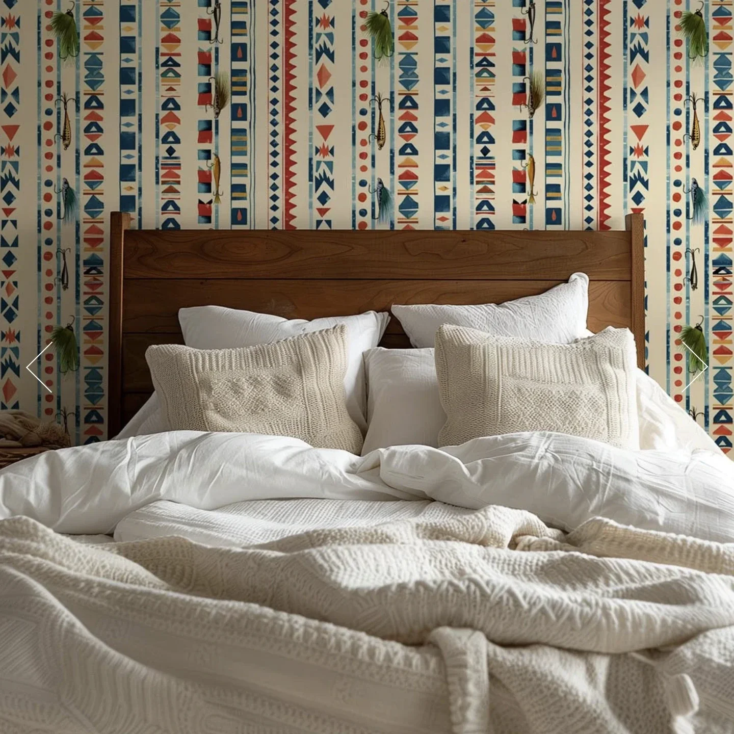
© Courtesy Willem Hendrik Design
Etsy Rising — The Handmade Revival
After years of mass-produced sameness, 2026 marks a return to individuality. Etsy and other artisan marketplaces are once again the secret weapons of designers looking to inject authenticity into a space.
Clients are craving objects that feel human — imperfect ceramics, woven wall pieces, hand-forged brass, and vintage rugs that tell a story. These pieces cut through the algorithmic aesthetic that dominated the past decade.

Rather than sourcing everything from large retail chains, designers are mixing in one-of-a-kind accents from independent makers. A sculpted candleholder from Portugal, a framed textile from India, or a hand-thrown vase by a small-batch ceramicist in Oregon adds narrative weight to even the most minimal interior.
This isn’t nostalgia — it’s a recalibration. 2026’s luxury is not about price tags; it’s about provenance, personality, and connection.
Paint Finishes and Applications
2026 redefines how paint behaves — finish now expresses as much as color.
High Gloss & Lacquer Drama
Glossy ceilings and lacquered trim are back. They bounce light, expand rooms, and add sophistication. Use dark hues like navy or oxblood for depth and modern glamour.
Matte & Mineral Depth
Matte and mineral paints remain the quiet heroes of bedrooms and living spaces — calm, light-absorbing, and serene. Bauwerk, Portola, and Romabio mineral lines offer breathable texture and subtle tonal variation.
Venetian & Roman Plaster
Lime plasters evolve beyond accent walls. Applied across entire rooms, they create timeless movement and a natural, tactile richness ideal for entryways or fireplaces.
Quick Finish Guide
Use this as a reference when pairing surfaces with finishes:
Living rooms → matte or dead-flat for soft shadow and depth.
Ceilings → gloss for height, flat for calm contrast.
Kitchens & baths → eggshell or satin for durability.
Trim & doors → semi-gloss or high-gloss to emphasize structure.
Fireplaces & accents → plaster or mineral paint for texture and dimension.
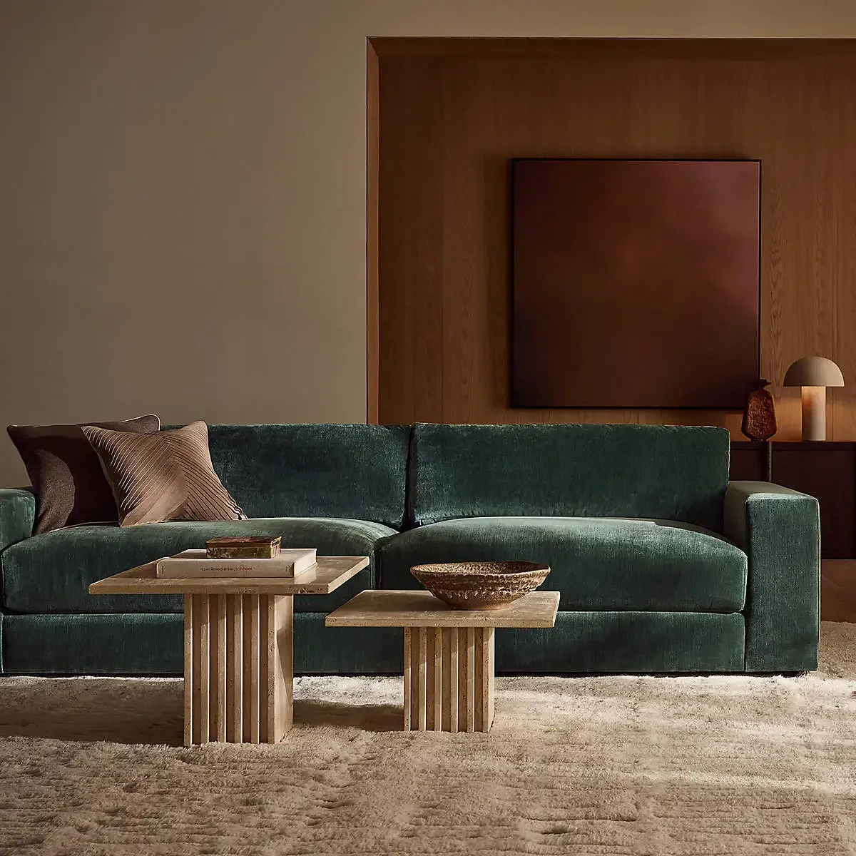
© Courtesy CB2
Paint Vendors & 2026 Colors of the Year
Every major paint house has released its forecast—proof that color in 2026 is richer, warmer, and more character-driven. Below is a look at the leading brands and their standout hues for the year ahead (links can be set as no-follow for Squarespace SEO best practices).
Benjamin Moore — Silhouette AF-655
A warm espresso-charcoal neutral that feels timeless and luxe.
Behr — Hidden Gem (N430-6A)
A smoky jade blue-green — the “new neutral” — offering grounded calm.
Sherwin-Williams / HGTV Home — Universal Khaki SW 6150
A balanced tan that bridges climates and styles, reflecting 2026’s return to comfort.
Glidden — Warm Mahogany PPG1060-7
A red-terracotta blend — bold yet classic — perfect for statement cabinetry or dining rooms.
Dutch Boy — Melodious Ivory 313-2DB
A creamy neutral signaling the comeback of soft warmth.
C2 Paint — Epernay #639
A pale ochre yellow inspired by European heritage interiors.
Graham & Brown — Divine Damson
A deep ox-blood plum adding moody sophistication.
Valspar — Warm Eucalyptus 8004-28F
A soft sage-green with gray undertone — restorative and grounded.
Clark + Kensington — Hazelnut Crunch 09A-5
A deep brown-red tone channeling cozy minimalism.
Krylon — Matte Coffee Bean
A dark brown accent shade that elevates furniture and décor.
Farrow & Ball — To Be Announced
Anticipated to continue their velvety heritage palette — moody, character-rich, and timeless.
Taste-Makers & Design Influencers to Follow
Beyond designers, 2026 celebrates people with discernment — creatives, designers, architects, stylists, and curators who influence how we layer, live, and feel design. These are some of my favorite voices that define the visual and emotional direction of modern interiors.
Just click on their handles to navigate to their IG profile. They are in no particular order.
- Athena Calderone — @eyeswoon
Modern organic interiors layered with texture, warmth, and mood. - Jake Arnold — @jakearnold
Master of mood and layered luxury with a distinctly human warmth. - Amber Lewis — @amberinteriors
California comfort meets global texture and lived-in sophistication. - Colin King — @colinking
Minimal composition, poetic restraint, and editorial-level styling. - Heidi Caillier — @heidicaillierdesign
Romantic palettes, nostalgic patterns, and quietly layered depth. - Natalie Myers — @veneerdesigns
Refined bohemian modernism that balances texture and ease. - Sean Anderson — @seanandersondesign
Moody, masculine interiors defined by weight, tone, and emotion. - Zoe Feldman — @zoefeldmandesign
Art-driven storytelling with confident color and balance. - Justina Blakeney — @justinablakeney
Vibrant pattern, global influences, and unapologetic joy in design. - Eddie Maestri — @eddiemaestri
Fearless sculptural form and the benchmark for design confidence. - Emily Henderson — @em_henderson
Light-filled, approachable interiors blending modern and vintage. - Steve Cordony — @stevecordony
Editorial refinement and tonal luxury rooted in balance. - Dabito — @dabito
Color-forward storytelling infused with playful, soulful character. - Paloma Contreras — @palomacontrerasdesign
Classic elegance and global influence blended into livable luxury.
Closing Thought
From Bend to Kansas City, New York to Miami, 2026 interior design is about connection — color that comforts, materials that speak, and form that feels alive. It’s not about trend chasing; it’s about emotional durability.
At Willem Hendrik Design, we see this shift daily: clients seeking calm, richness, and authenticity. The future of interiors is tactile, thoughtful, and beautifully real.